I spent four years studying graphic design and three more working at an agency before I realized I'd been completely ignoring design principles in my actual home. A single framed print runs me $30 to $80 and changes a whole wall.
The connection clicked when I was working on a poster layout and thought: this is exactly what I'm trying to do with my living room. Create hierarchy. Establish a focal point. Use contrast. Leave breathing room.
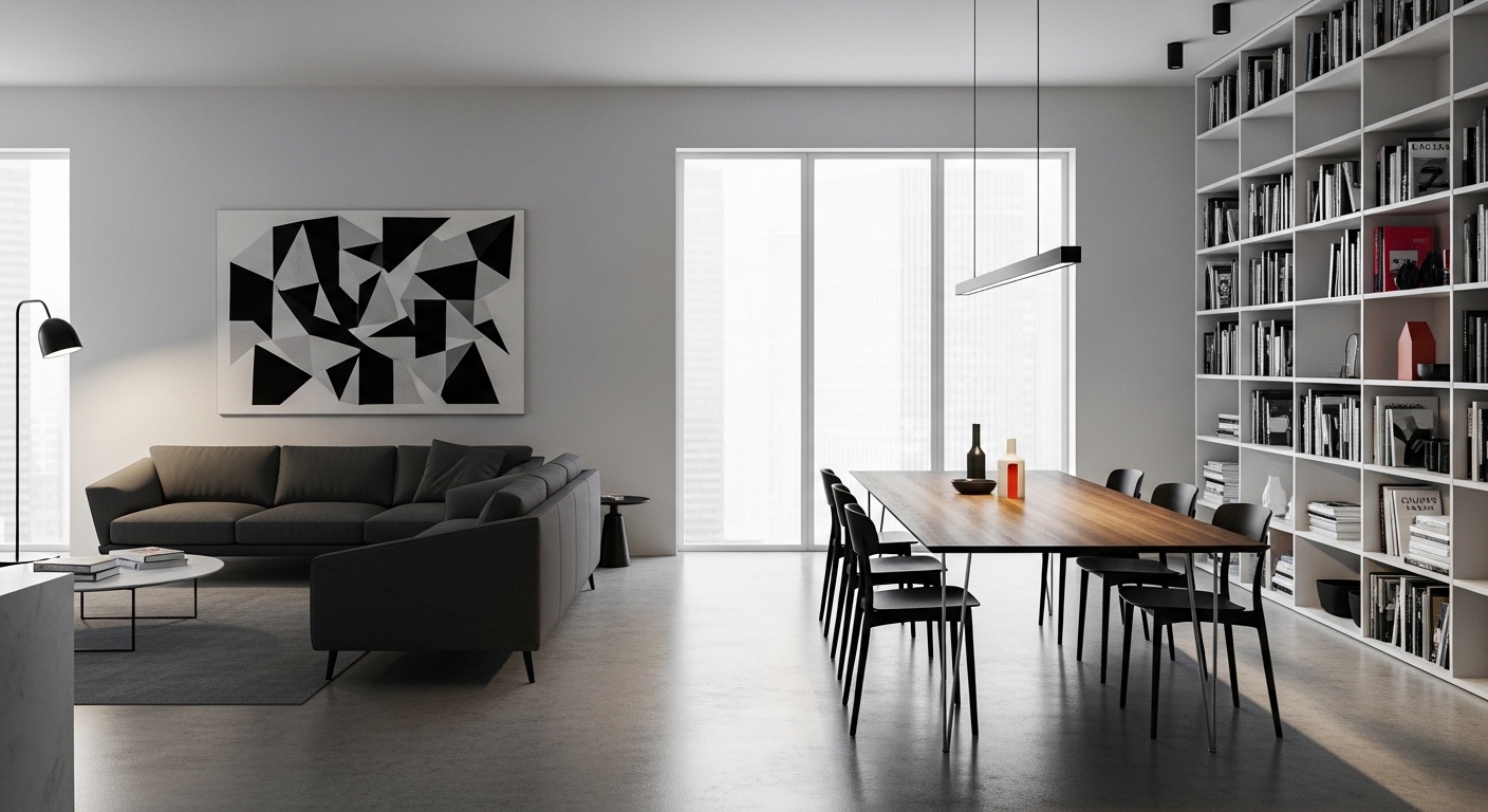
Hierarchy
Every poster has a primary element. The thing your eye goes to first. Every room should too. I chose a gallery wall in my living room as the focal point and made everything else secondary to it. The pendant light above the coffee table reinforces the focal zone.
White Space
In design, white space isn't empty. It's where the eye rests. In my apartment, I leave one wall completely bare and keep one shelf deliberately open. The visual rest those empty spaces provide makes the styled areas read more clearly.
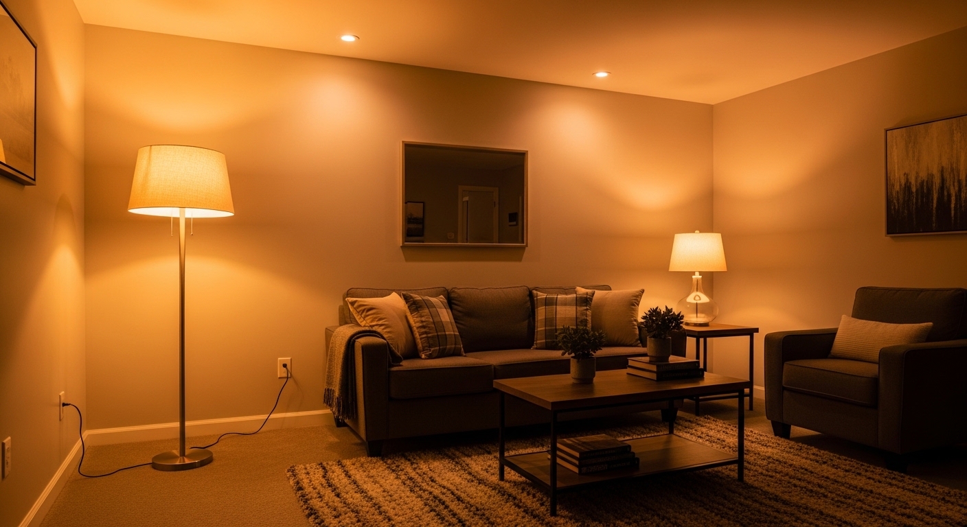
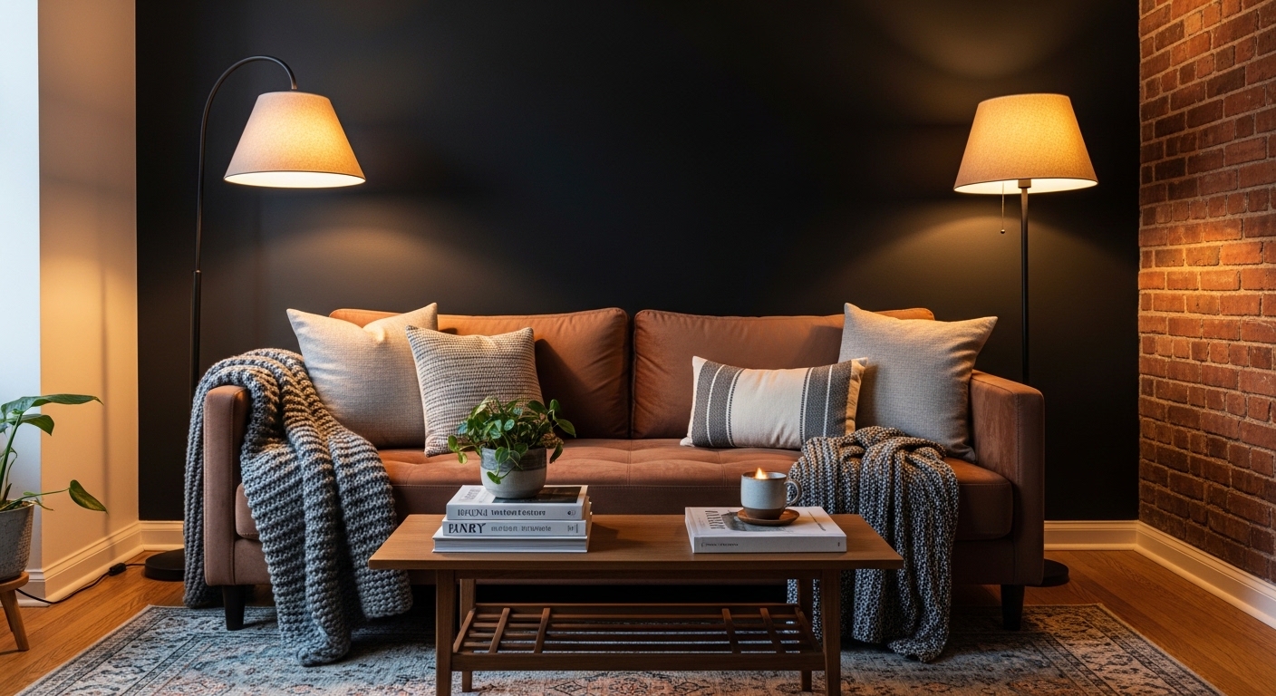
Contrast and Light
In graphic design, contrast creates legibility. In a room, contrast creates interest. Dark wall against a light floor. A black wall sconce against a white wall. The contrast makes both elements more visible, and more intentional.
Shop this post: accent lighting and pendant lights